Skip to the content
Tim Highfield
researcher and Lecturer in Digital Media and Society, University of Sheffield
Menu
research
Social Media and Everyday Politics
Instagram
Digital Time
Mapping Movements
Visual Cultures of Social Media
Digital Media, Location Awareness, and the Politics of Geodata
publications
books
journal articles
book chapters
thesis
other writing
academic talks
media and public events
blog
cv
about
Posts
Instagram: Visual social media cultures (Ideas Alive 2020)
…
Examining Instagram Time (#ica20)
…
“I’m singing with my laptop, making up new songs” (The Web That Was, June 2019)
…
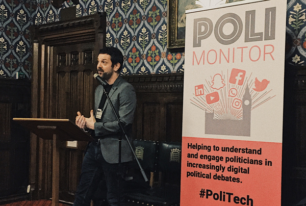
The everyday politics of social media (Palace of Westminster, March 2019)
…